top of page
Checkout Button
Making it easier for customers to complete their orders quickly and seamlessly.

A UK supermarket was facing challenges with users struggling to find the checkout button, leading to high cart abandonment rates. I was tasked with redesigning the checkout experience. This project spanned research, design, and testing, resulting in a streamlined user journey and significant improvements in conversion rates and annual revenue.
01. Overview
Project
Improve the user journey and checkout process by redesigning the checkout button to make it more accessible and easier to find, reducing friction during the final stages of the user journey.
Role
UX Designer & Researcher – responsible for conducting research, designing wireframes and high-fidelity mockups, and overseeing the implementation to ensure a smooth handoff to the development team.
Objective
Enhance the user journey, reduce cart abandonment, and increase conversion rates by improving the visibility and functionality of the checkout button.
02. Problem
Customer feedback from the contact centre revealed that many users struggled to find the checkout button, leading to frustrations and a significant increase in cart abandonment. Customers wanted a quicker, more intuitive way to complete their online orders.
Content Square analytics supported these findings, showing a significant drop-off in conversions when users had difficulty locating the checkout button. The data highlighted the need for a smoother and more visible checkout process, especially as competitors had already streamlined their checkout flows.
03. Design Process
Research & Analysis
Analysed session replays and user journey data using Content Square to identify user behaviour patterns and pinpoint areas of friction.
Collected feedback from the contact centre to understand customer frustrations and struggles with the checkout process.
Conducted a competitor analysis to identify areas for improvement and ensure Iceland’s checkout process aligned with industry best practices.
Reviewed data analytics on bounce rates and conversion metrics to further support design decisions.
Wireframes & Ideation
Developed low-fidelity wireframes using Sketch to explore different placement options for the checkout button, keeping user personas and behaviour in mind.
Created a user story: “As an Iceland customer, I want to quickly find and use the checkout button so I can complete my order easily.”
Iterated on designs based on feedback from stakeholders, refining the flow to improve the user journey while adhering to brand guidelines.
High-Fi Design
Designed high-fidelity prototypes in line with Iceland’s branding, with a focus on ensuring the checkout button was prominent and easy to find.
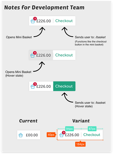
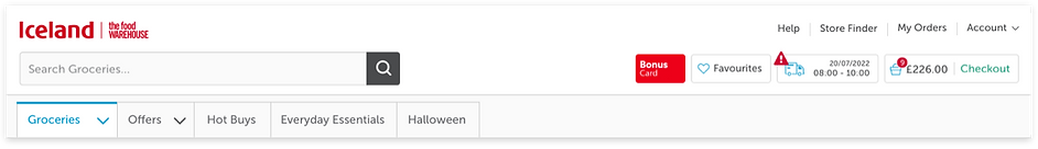
Placed the checkout button in the header, making it accessible throughout the user’s journey.
Included a disabled checkout button with a tooltip explaining that the user hadn’t met the minimum order amount, which improved user clarity.
Created responsive designs to ensure the checkout button worked seamlessly across both desktop and mobile devices.
Prototype Testing & Development
Built an interactive prototype using Invision for stakeholder testing and user validation.
Facilitated a design handoff to the development team, ensuring all functional and design elements were clearly communicated through detailed design specifications.
Conducted quality assurance testing to guarantee the solution was implemented correctly and met user needs.
04. Solution & Results
Solution
The redesign of the checkout button aimed to make it easier for users to complete their purchases, improving the overall user journey. The solution included:
Moving the checkout button to the header, making it visible and accessible on every page of the shopping process.
Offering dual access through the basket and mini basket, giving users multiple pathways to checkout.
Adding tooltips to the disabled checkout button when users didn’t meet the minimum order amount, increasing transparency.
Ensuring the design was responsive, allowing users to navigate smoothly across devices.
Results
A significant reduction in cart abandonment as users could easily find and use the checkout button.
A/B testing showed increased conversion rates as the redesign improved user flow and made the final steps of the purchasing process smoother.
An estimated £5 million in annual revenue increase due to higher conversions and more streamlined user journeys.
Overall improvement in user satisfaction, making it easier and faster for customers to complete their online orders.

bottom of page